This isn't just an aesthetic choice. First impressions form in seconds, and the wrong finish can undercut a brand's credibility, readability, or durability before anyone reads your title. A law firm's card printed in high-gloss can feel out of place. A photographer's portfolio card in flat matte can lose its punch.
This guide breaks down the real differences between matte and glossy so you can choose with confidence. And if you're still torn, the team at Minuteman Press in Jacksonville can walk you through physical samples of both finishes before you commit to a full print run.
Key Takeaways
- Matte is non-reflective and understated—the only practical choice if you write on the card
- Glossy delivers vibrant color, sharper photos, and better scuff and moisture resistance
- Neither finish wins outright; pick based on design, industry, and how the card gets handled
- Spot UV combines both finishes on one card, adding shine exactly where you want it
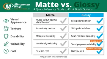
Matte vs Glossy Business Cards: Quick Comparison
Here's how the two finishes stack up across the factors that actually matter when you're placing an order.
Visual Appearance
- Matte produces soft, muted, non-reflective color that reads as sophisticated and understated
- Glossy produces vivid, saturated color that makes photos and bright palettes pop off the card
Texture and Feel
- Matte has a smooth, dry, cardstock-like texture. Soft-touch lamination takes it further with a velvety finish
- Glossy has a slick, cool, polished surface that signals energy and modernity
Durability
- Glossy thicker coating shields against scuffs, moisture, and fingerprints—better for cards that live in wallets or pockets
- Matte shows fingerprints more easily and wears slightly faster; heavier cardstock closes much of that gap
Writability
- Matte wins here—ballpoint ink dries almost instantly, ideal for jotting a number or meeting note on the spot
- Glossy causes ink to smear and bead instead of absorbing, so it's impractical for handwriting
Cost
Standard matte and standard glossy typically carry the same price at most print shops. The upcharge shows up with premium treatments instead:
| Finish Type | Relative Cost |
|---|---|
| Standard matte | Baseline |
| Standard glossy | Baseline (same as matte) |
| Soft-touch matte | Slightly higher |
| Spot UV | Premium tier |
According to 4OVER4's 2026 printer guide, the real cost jump comes from add-ons like soft touch or spot UV rather than the base finish itself.
What Is a Matte Finish?
A matte finish is a non-reflective coating that absorbs light instead of bouncing it back. That's why matte cards never glare under office lighting or camera flash, and why text stays crisp and easy to read from any angle.
Core benefits of matte:
- Glare-free readability, even under harsh light
- A premium, tactile feel that conveys quality
- Full compatibility with pen ink, so you can write directly on the card
The premium step up is soft-touch lamination, sometimes called velvet lamination. It adds a smooth, almost fabric-like texture on top of standard matte without altering the printed color underneath. It's a popular choice when a brand wants matte's calm look with an extra layer of tactile luxury.
Where Matte Business Cards Work Best
Matte fits naturally with professional, text-forward brands that want to feel calm and trustworthy rather than flashy:
- Law firms and financial advisors
- Therapists and healthcare consultants
- Minimalist brand identities built around typography, not imagery
It's also the better pick for anyone who takes notes during meetings. Salespeople and consultants who jot a follow-up date or personal cell number on the back benefit from ink that dries on contact instead of smearing.
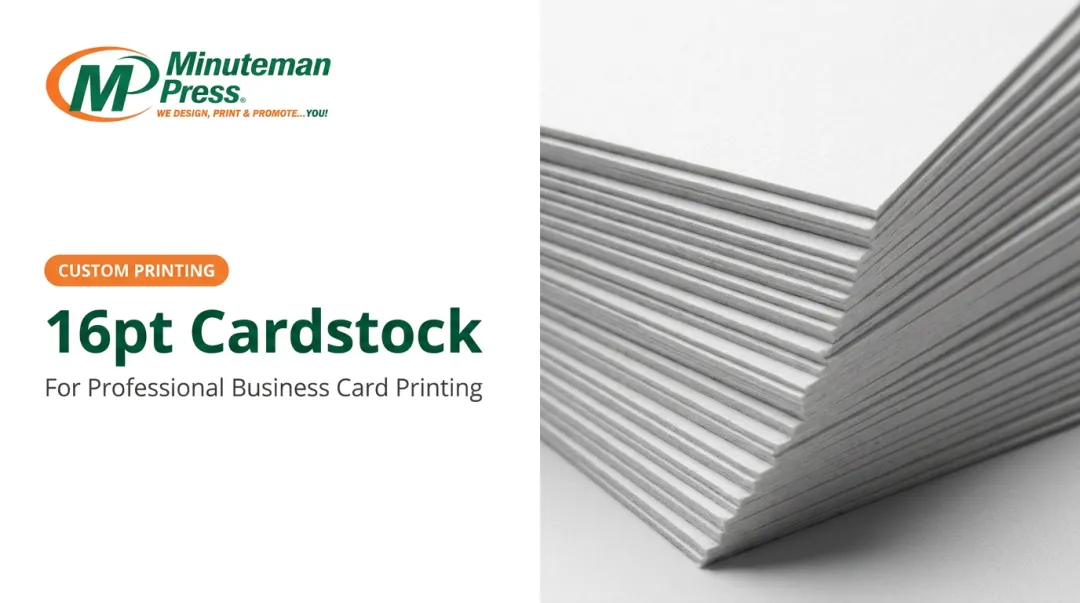
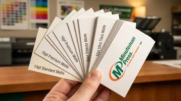
Paper weight matters too. A lightweight card can undercut even the best matte finish. Print shops commonly offer business card stock from a light 14-16pt weight up to a substantial 32pt for a premium feel.
At Minuteman Press in Jacksonville, cardstock options run from 60# through 100# cover stock. The heavier end delivers the sturdy, higher-end feel a matte card needs.
What Is a Glossy Finish?
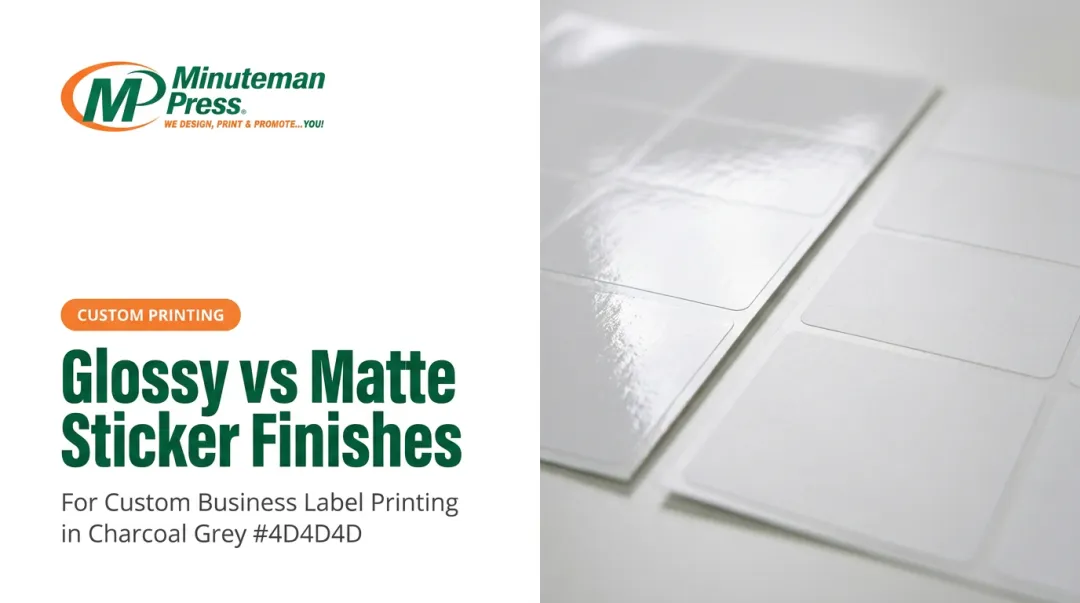
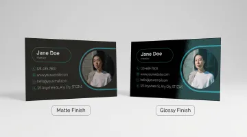
A glossy finish is a reflective laminate or UV coating applied over the printed ink. That coating amplifies color saturation and sharpens fine photo detail, making it the go-to choice when the design leans on imagery rather than text alone.
Core benefits of glossy:
- Vivid, saturated color reproduction
- Sharper detail on photos and complex graphics
- A tougher protective layer against scuffs and moisture
A related option is spot UV, where a glossy, raised accent is applied to specific design elements, like a logo, on an otherwise matte card. It gives you the calm base of matte with a targeted pop of shine and texture exactly where you want attention drawn.
Where Glossy Business Cards Work Best
Glossy earns its keep in industries built around visuals:
- Real estate agents showcasing property photos
- Restaurants and hospitality brands featuring food photography
- Event planners, retailers, and entertainment brands with bold, colorful visuals
A property photo printed glossy on a card handed out at an open house reads noticeably brighter and sharper than the same image on matte stock.
A peer-reviewed print study published in Dyes and Pigments found that higher-gloss paper surfaces produced a larger color-gamut volume than matte alternatives when printed under identical conditions. More of the color spectrum gets faithfully reproduced, which means richer, more accurate color on photo-driven cards.
Which Finish Should You Choose?
Run your decision through three questions before you finalize anything:
- Does your design lean on photos or bright color, or is it mostly text? Photo-heavy designs favor glossy; text-driven layouts favor matte.
- Will the card get written on? If yes, matte is the only practical option.
- What tone are you going for? Calm and premium points to matte. Bold and energetic points to glossy.
In short: matte for understated, text-driven brands; glossy for visual, colorful, photo-heavy ones.
Here's the catch, though: the finish rarely ruins a card by itself. The most common business card mistake is poor design planning that would sink either finish:
- Cluttered layouts with no breathing room
- Illegible fonts or type sized below 8pt
- Pixelated images that weren't sized at 300 DPI
- A finish mismatched to the content, like glossy over dense text or matte over a photo-forward design
Screens can't show you how a finish reflects light or feels between your fingers. Ordering a small sample batch of each is the most reliable way to decide before a full run goes to press.
Minuteman Press in Jacksonville can put matte and glossy samples in your hands and help you proof the design first. That quick check beats an expensive reprint later.
Conclusion
There's no universal winner between matte and glossy. Match the finish to your design, your industry, and how the card will actually be handled—whether it's tucked in a wallet, handed out at an open house, or scribbled on during a client meeting.
That match is what makes the finish reinforce everything your card is already trying to say. A mismatch can make even a strong design fall flat.
If you're planning your next print run, reach out to Minuteman Press in Jacksonville for hands-on samples and design guidance before you commit.
Frequently Asked Questions
Does glossy or matte look more professional?
Matte looks more professional and modern thanks to its understated, non-reflective finish. Glossy still works well for brands wanting a bolder, more energetic first impression.
What is a common mistake on business cards?
A poorly planned design is the biggest culprit: cluttered layouts, illegible fonts, pixelated images, or a finish that doesn't match the content type.
Can you write on a glossy business card?
Not easily. Ink typically smears or beads on the slick surface and takes far longer to dry, so matte is the better choice for on-the-spot notes.
Which business card finish is more durable?
Glossy's thicker coating resists scuffs, moisture, and fingerprints slightly better. Matte on heavier stock, like 32pt, still holds up well for everyday handling.
Are matte or glossy business cards more expensive?
Standard matte and standard glossy are typically priced the same. Cost differences usually come from paper weight or premium treatments like soft touch and spot UV.
Can I combine matte and glossy finishes on one business card?
Yes. Spot UV applies a glossy, raised accent—like a logo—to specific areas of an otherwise matte card, so you get texture and shine in one design.
Visit Us in Jacksonville
Minuteman Press Jacksonville offers matte, glossy, soft-touch, and spot UV business cards, and can put physical samples in your hands so you choose the right finish before committing to a full print run. Call 904-733-5578 or stop by 4185 Sunbeam Road, Suite 100, Jacksonville, Florida 32257 to see the options and proof your design.